Node Redesign
Good design is universal. All people should be able to use a product. So, my first act as Design Lead on the team was to address a very serious issue.
Low vision users were letting us know that the nodes they regularly used were not accessible to them. The colors, which were the only means of differentiating purpose of the nodes, were indistinguishible from one another. To make matters worse, the colors used were not very visible on a white background, making them even less accessible.
Several hundred nodes had to be redesigned in a short period of time. This meant creating a process that would allow us to design these quickly at scale while balancing out the rest of the Carbon 10 update, researching the intent of the node, and then designing with that purpose in mind on the new Carbon grid.
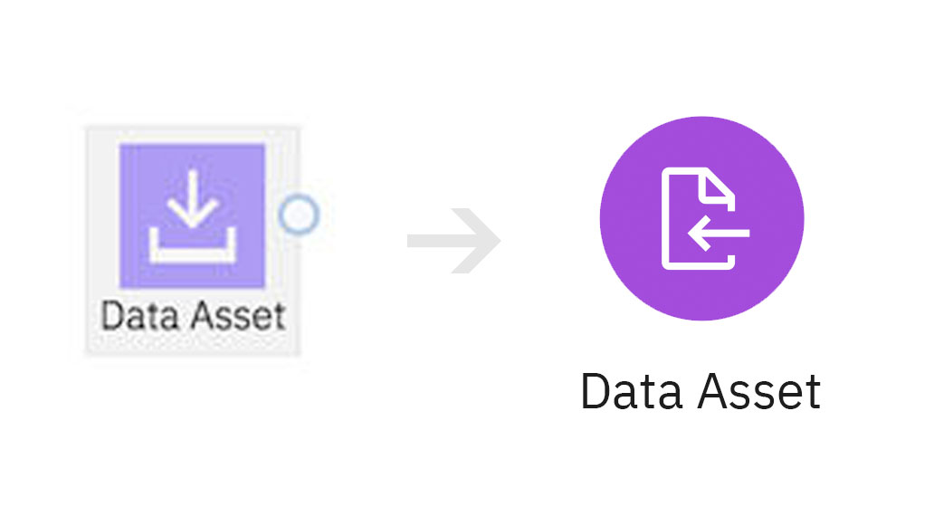
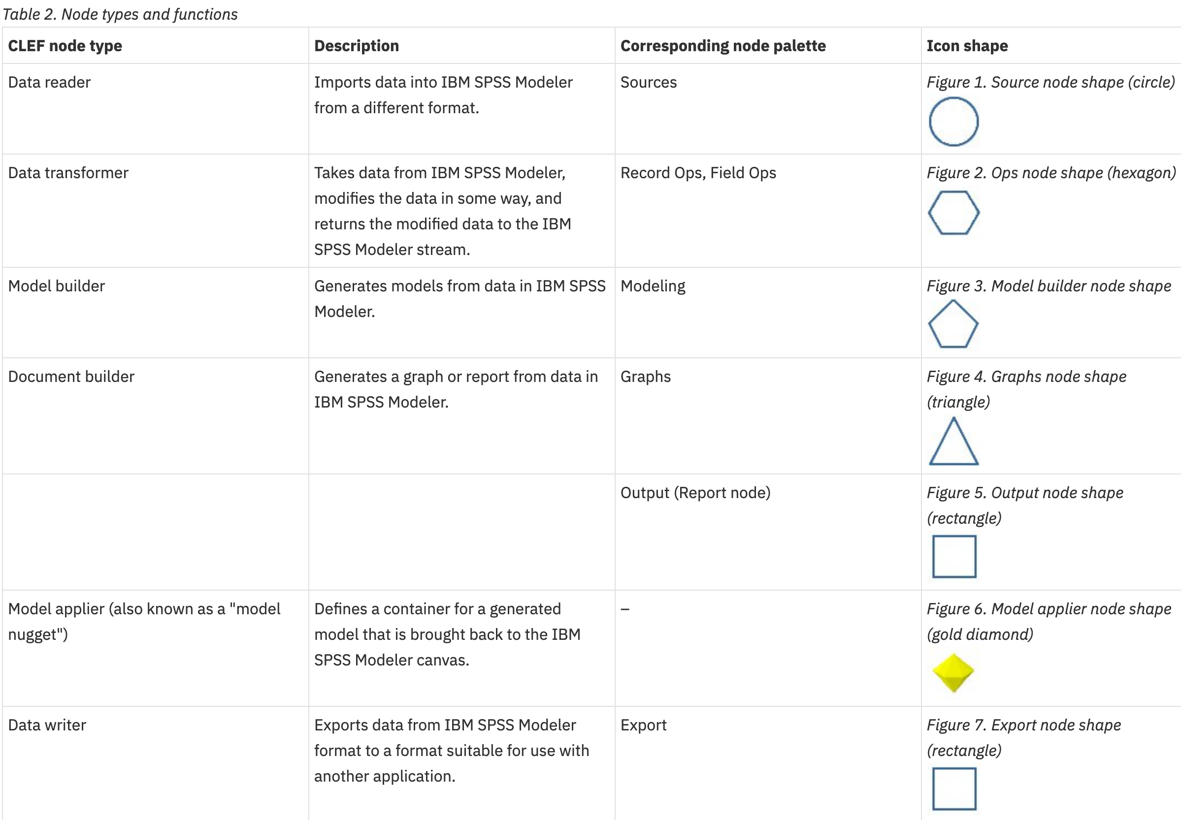
Instead of throwing out the old designs entirely, we ended up combining the legacy shape-based styling with the most recent color-based styling of the cloud version of Modeler. However, we updated the styling to reflect a 3:1 value ratio for contrast and the shapes and icons became more modern to reflect the update to IBM's Carbon 10.
Project Specs
Duration: 3 weeks My Role: Art director, Visual DesignerTeam: 2 designers
Design Problem: Users need an accessible way to differentiate between the hundreds of nodes that could potentially be on their canvas.
 A before-after view of the Data Asset node


These were the shapes that were used to inspire the icon types.
![]() A collection of the nodes that were created during the first round of updates.
A collection of the nodes that were created during the first round of updates.